
This post was sponsored by British Ceramic tile who kindly provided the tiles for the project and Milton and King who provided the wallpaper.
I was so excited to start planning the guest bathroom transformation, it’s a room that’s only used when we have guests (or for the occasional indulgent bath) so could be fun and totally wild. It was a challenge as the space is in the eaves with irregular walls, ceiling and a ‘T’ shaped floor plan but most exciting of all was that it was literally carte blanche- whiter than white with zero personality, and not my style at all as you may have gathered!

The bland before… The bold after
I began my search for a floor tile as the starting point for my scheme, I wanted a relatively large pattern repeat, and because we planned to keep the curved corner bath, I wanted big, square tiles for ease of cutting. The final things on my checklist for floor tiles were bold pattern and neutral colour, I wanted an eye-catching tile that would work with and not against the bold colours I love to use in my decor. I chose the ‘Henry’ tile with its larger pattern and subtle texture, I also loved the fact that it could be laid in different rotations to create either a star or box illusion pattern.
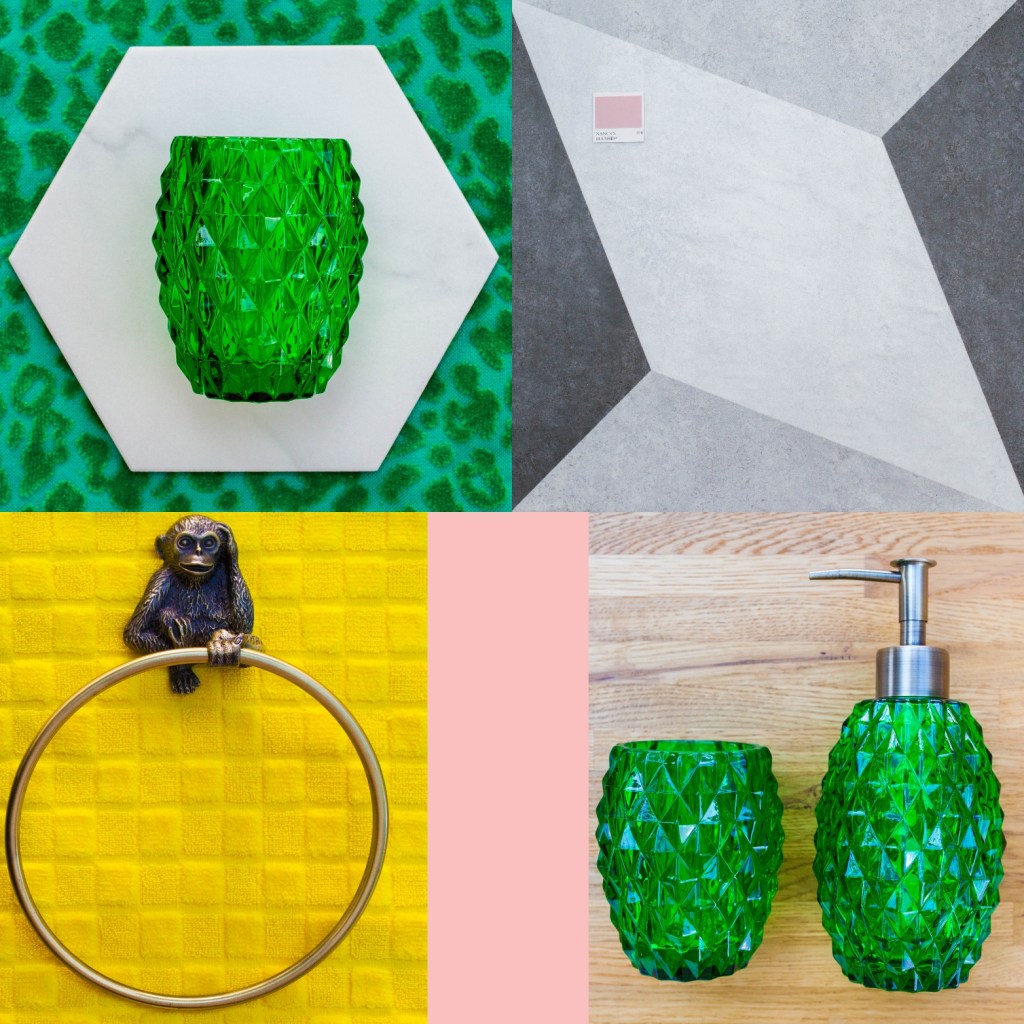
Next up was choosing a backsplash tile for around the bath and sink. I was looking for a white tile for this because I wanted to experiment with using one of my accent colours in the grout and wanted a good contrast. My search ended when I found the White Marble Hexagon tiles and fell deeply in love! This shape and detail of this tile are absolutely beautiful and I couldn’t wait to give it my own twist.

The marble hexagon tile 
The Henry floor tile
With the tiles chosen, I set about creating a mood board to try them alongside the accent colours I had in mind for this scheme; yellow, green and pink. The crisp lines of the hexagon tile popped against the emerald green I planned for the grout and the greys of the Henry tile stand up to my bold yellow and compliment my softer pink which I planned to use to paint the base of the bath. At one stage, the walls were going to remain white but when Milton and King got in contact, I knew exactly the wallpaper that would work in here and transform the space from bland to brilliant.
The first decision I had to make was which pattern to create with the Henry tile, as they can be laid in different rotations to create either a star or box illusion pattern. I went with the star pattern which definitely suited our floor space best and created a kind of path leading you up to the bath.
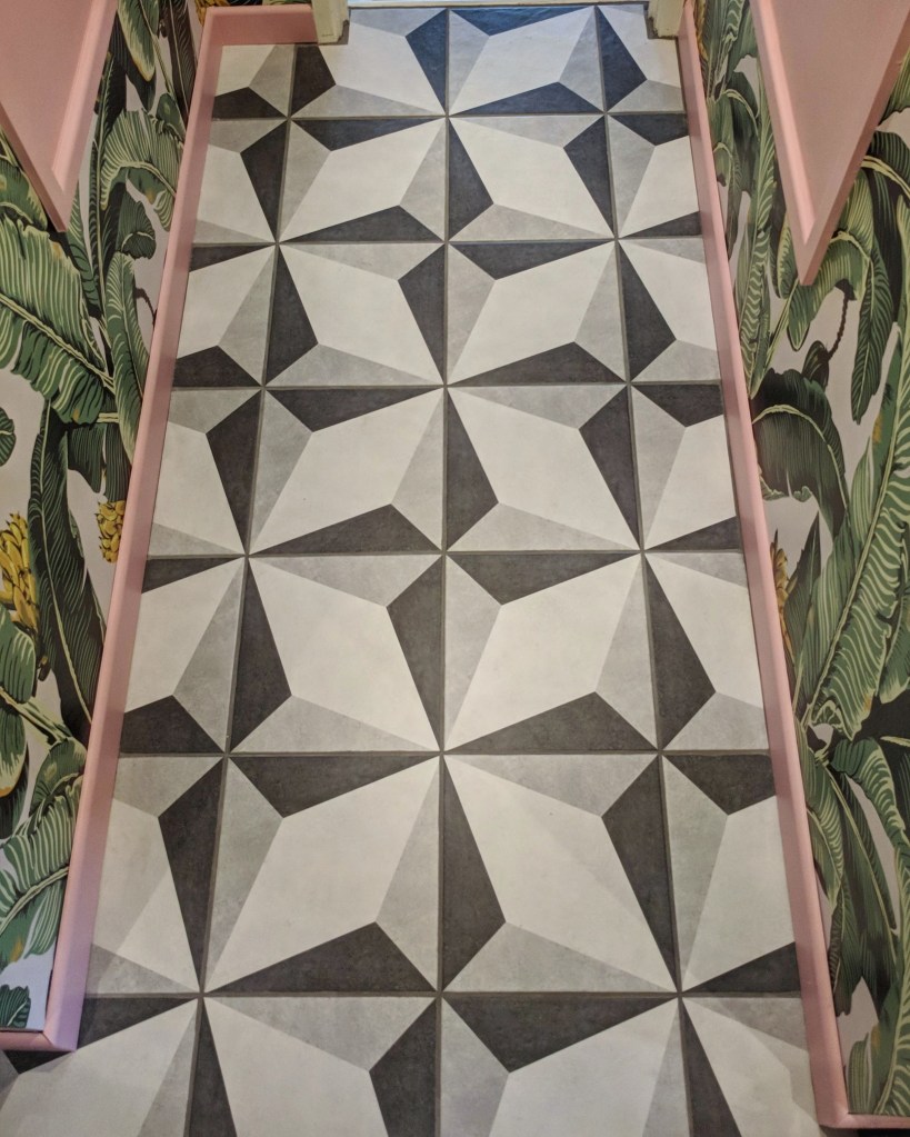
I used a dark grey grout to create a seamless pattern on the floor and then got a little more creative when it came to the hexagons on the walls. I had planned to use a coloured grout and pick out the green of the wallpaper and accessories I was using in there. I had a really vivid picture in my head of a really leafy green grout but when I couldn’t find what I was after off the shelf (and got funny looks for even asking) I decided to mix my own bespoke colour using white grout and emerald green acrylic paint which worked perfectly (although I’ll admit I had my doubts during the mixing process!)

Once the initial tiles were up, I had the urge to go rogue and add some irregular tiles cascading up and down around the ends of the bath. This was a risk because it was difficult to visualise the end result, and in order to stick the tiles to the wall I had to cut holes in the wallpaper and tap nails in to hold them up whilst the tile adhesive set so there was no going back! Luckily, my risk paid off and I love the asymmetry, especially as the bath is also an irregular shape.

The view from the landing before 
The view from the landing now
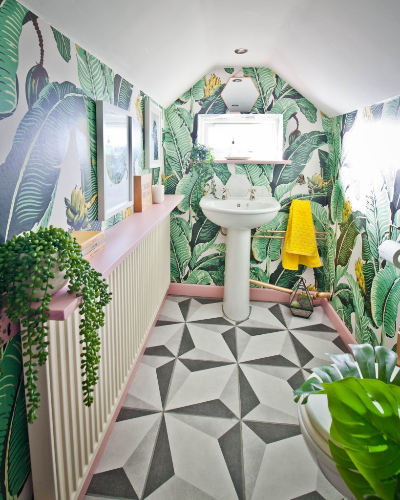
Even though I already had plenty of pattern coming from the floor tiles and the shape of the wall tiles, I knew my beloved tropical wallpaper would work well too because the neutral tones of the tiles could support the bold colours of the paper despite the pattern clash. I could then add my yellow and green towels, green woven baskets for storage (toys!), cut green glass soap dispenser and plenty of plants to accessorise the space.

Desperately adding colour with bath toys! 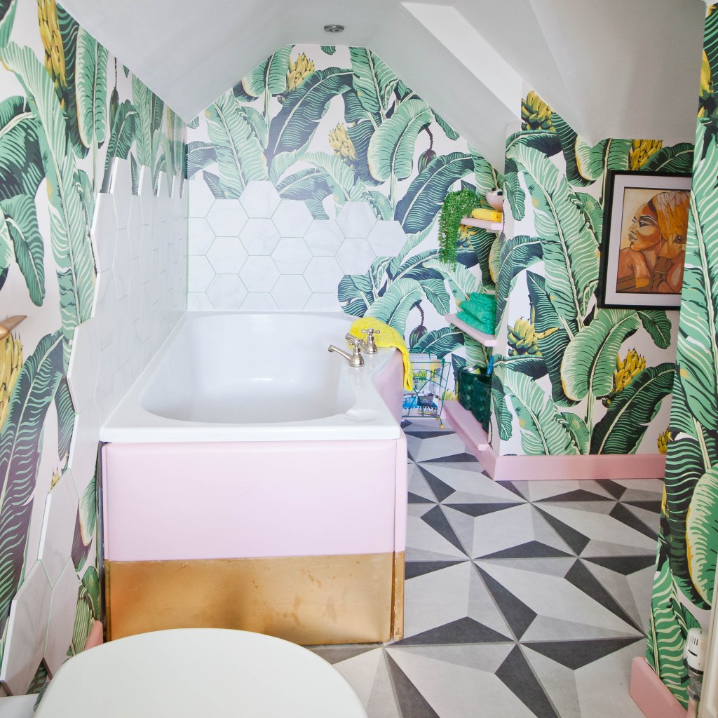
The painted and gold leafed bath
The final accent colour was pink and I really went to town painting the bath panel, the skirting boards, windowsill, shelves and cupboards before adding gold hardware and gold leaf to the base of the bath. I could never have dreamed this project would come together as well as it did but I learnt so much along the way and have really enjoyed creating a fun and original space that just makes me smile.

Leave a comment