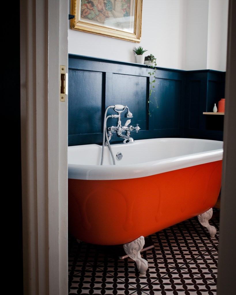
When we moved in to our first home, we were terrified of using colour and painted everything 50 shades of grey. To me, using colour felt like something interior designers did, not first-time buyers. As we spent more time in the house, the grey felt less and less ‘us’ and we started to fill it with pieces that reflected our love of colour and gradually the grey was phased out and the colour crept in, on to the walls, the floors and even the bath!
I have always been a believer that our surroundings can impact our well-being and that colours around us can have a profound effect on our moods and actions. This is no more important than in the rooms of your home you wake up in, cook, entertain and relax in.
Colour psychology has long been used in marketing to subconsciously influence our buying habits but how can we use it at home to create the atmosphere and ‘vibe’ we’re after? If you’re a diehard neutrals fan then the thought of adding colour to your home can be a frightening thought, but start small. It can be as simple as a few accessories- think vases and candle holders, a bit more daring with splashes of colourful cushions and throws or a full-on colour explosion with a statement chair or wallpaper. Needless to say I am a fan of the colour explosion!
Colours can be roughly divided in to two groups, ‘warm’, reds, oranges and yellows and ‘cool’ such as blues, greens and purples or in colour psychology, four ‘seasons’ from Spring with it’s light bright hues though to Winter and it’s bright, intense colours. Individual colours and groups have both positive and negative associations and work well in different rooms for different people, so finding your personal palette and surrounding yourself with colours which make you feel good is key.

It’s easy to scroll though squares on Instagram wondering how effortlessly some people put colour schemes together, and while some are definitely gifted at this, the fool proof way to achieve the look you’re after is to use the tried and tested ‘Wright theory’ devised by Angela Wright in the 1980s which groups colours in to families echoing the natural patterns of the seasons and each personality has a natural affinity with one group. Read on to discover yours!
Starting with Spring, as you might expect, these are fresh, clean colours including bright yellow, green, red, blue, purple and coral. This palette is youthful and associated with warmth and motivation so would be perfect in a child’s bedroom or office space for example.

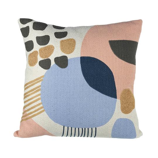
Summer colours are cool and subtle, think muted hues of pink, lavender and cornflower blue, they have associations with being cool, calm and collected and so would be perfect in an open plan space or bedroom. I’m in love with the ‘Cleo’ Chaise from @honora_uk , try it with the ‘Tori’ cushion.

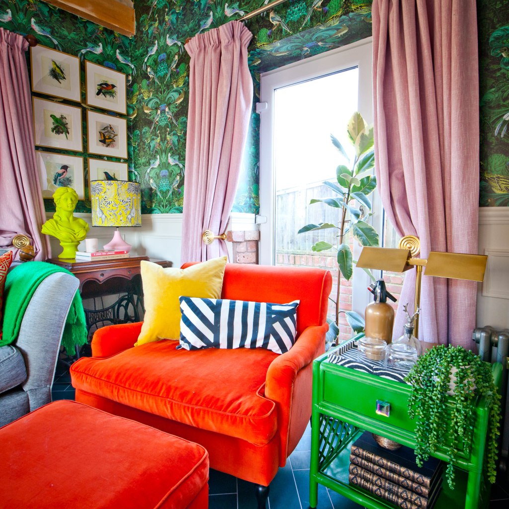
The Autumn palette brings us fiery, warm shades of gold, burnt orange, olive green as well as rich purples and warm blues. This grouping is intense, strong and is a great cosy palette for a living room or snug.
In Winter, the colours are cold and extreme (like the weather I guess!) and include black, both dark and light blue as well as magenta, yellow and turquoise, this palette is bold, commands respect and works well in an open plan space with lots of white as a base.
So which palette resonates with you the most? I think my home would suggest Winter with Spring emerging! Having said all of this, if there is a colour or colour combination you love and it makes you smile, then go for it, make your own rules and most importantly have fun with it!
This post was originally written for @honora_uk and I was kindly gifted the Sasha Orange armchair and footstool pictured.

Leave a comment